KeyCreator / View / Level / Overview / Level List Window
The Level List window is the pane the appears when you select the Levels tab in the Part Splitter Window. This pane contains important information relative to the levels, and the geometry they contain, in your part. By clicking in the appropriate cell, or by right-clicking and making a choice from the menu, you are able to modify the information contained in the Level List Window.
When a level is created through the level tree, the level properties dialog is displayed, through which parameters can be set for the new level.
When you right click a cell header, the Column Layout Context Menu appears.
Header Titles:
The header cell title blocks indicate the focus of each of the columns in the Level List. You can modify the order in which the levels are displayed by clicking each of the blocks. Note that you are also able to re-order the window headers as you like. To do this, click the header you intend to move, and drag it to the new position.
-
Level Name (also a column in Level Sets pane) - Toggles between listing the levels with the descriptors in alphabetical/reverse alphabetical order.
-
LNum (also a column in the Level Sets pane) - Level Number. Toggles between listing the levels in ascending and descending order.
-
Active – When a level is active, a mark will appear inside of the checkbox. In the example above, the level named "Upper Housing" is the active level.
-
Displayed (also a column in the Level Sets pane) – When selected the level is displayed. To display/un-display a level, click on the checkbox for that level in the Displayed column. Note that if any parent level is un-displayed (checkbox unmarked), the Displayed and Selectable checkboxes for that level are grayed out, indicating that the level will not be displayed or selectable, regardless of the state of the checkbox. The state can be changed even when the box gray.
-
Selectable – When selected, the level is selectable (the entities on the level can be selected for editing, etc). To make a level selectable/un-selectable, click on the checkbox for that level in the Selectable column.
-
Count (also a column in the Level Sets pane) - Toggles between listing the levels with the most/least entities first in the list.
-
Color – Allows you to select a color attribute for the level’s geometry from a dropdown. The color selection well will appear when you click anywhere within the Color cell. You can dismiss the well simply by clicking anywhere outside of it.
-
Flag – Allows you to select a pen number for the level’s geometry from a dropdown.
-
Style – Allows you to select a style number for the level’s geometry from a dropdown.
-
Width – Allows you to select a style number for the level’s geometry from a dropdown.
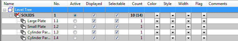
Entity Count Display:
When a level has child levels containing entities, the entity count for that level will be followed by a second count that includes the entity count for the level and all child levels. See the example below.
Example:
|
Level Number and Entity Count |
Entity Count Displayed As |
|
Level 1 contains 2 entities, file contains 4 entities
|
2 (4)
|
|
Level 1.1 contains 2 entities
|
2
|
|
Level 2 contains 2 entities
|
2
|
|
Level 2.1 contains 0 entities
|
0
|
|
Level 3 contains 0 entities, file contains 6 entities
|
0 (6)
|
|
Level 3.1contains 2 entities, file contains 4 entities
|
2 (4)
|
|
Level 3.1.1 contains 2 entities
|
2
|
|
Level 3.2 contains 2 entities
|
2
|
|